Credi.tips - TTI

UX-UI Design / Web Design

Profesional Experience 2019▲

Credit Cards acquisition
for different banks

Service

In Next Contact(Credi.Tips-TTI) I have a role a Visual Designer, more late of Creative Director
on this job I creating a design of the brands -Credi.Tips- and -Tu Tarjeta Ideal-, the primordial objective is acquisition of new customer in financial sector in specific on credit cards.


I redesign logo, web pages, social media banners, creation of landing pages for reception of leads in  launched campaigns for different platforms, for example Google ADS, Facebook ADS and Twitter, as well as the creation of UI of CRM for own data base.

My responsibilities
in the project.

I started working with Santander Bank and creation different ways for attraction customers and developed different type of graphics and finding a ideal customer in this moment create a profile customer or User Persona, after time starting working with CityBanamex and finally American Express, in each campaign I having between 500 to 800 customer daily for acquisition of credit cards.

During this time I learning about of how obtain a potencial customers in sector financial and generate short videos Ads for improve my traffic and obtain the best results, resolving guidelines for creation different formats and motion graphics.

The Brand

Redesign the brand credi.tips. I started with other typography and different color palettes, in the process of redesign I have benchmark and brainstorming for create a proposal design materials, other color palette and applicate in different format for media banners and infographics. 

The Web Site

The principal idea is sennding the request of customers they want find a credit card with best historial of credit, for the potencial customers the  requirements is necessary three simple data and this is more easy way to increment the solicitud of this credit products.

The fist step is release the principal web site with information about the different products and the requirements your needed for acquisition of this.

In the example image it a home page more simple design and impulse the request of the product be like for part of customer.

The Wireframe

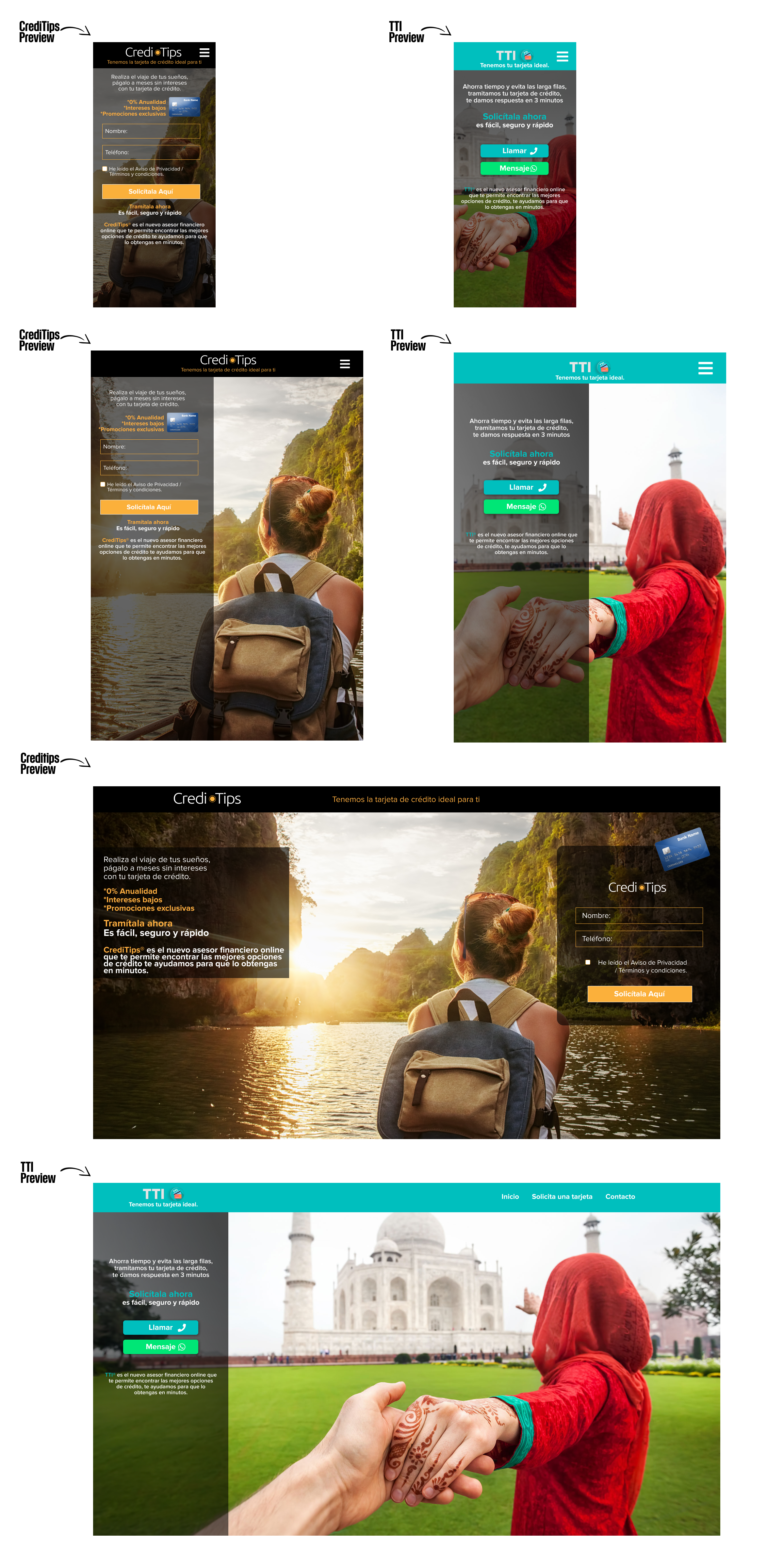
The principal idea is create proposal ideas in landing page, this is the example approved and functionals the landing page function in ‘Credi.Tips’ is reception of leads from GDN Facebook, Twitter and the data introduce in the CRM and after downloading for sending a contact center area.

In TTI is more flexible the landing page and creating buttons with other functions message and calling on this time is totally functional with reception and contact direct with the respective area o Contact Center.

This examples, I show Wireframing proposal for approved and Preview of landing page. On here is when can see all differences between landing pages and the result is the best.

The Landing Page

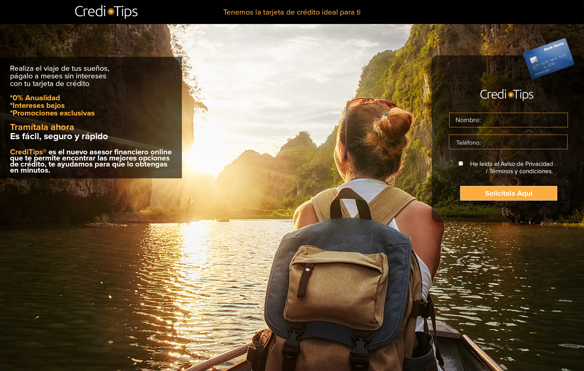
The principal idea is sending the request of customers they want find a credit card, the first way is on GDN Google Adds, create banners for promotional web site and the reception of customers is on landing pages and reception of data in my CRM for download all the data base everyday, after sendding to contact center area for contact client and enter the process the acquisition of credit cards.

But they analyzing the data base the customers, it’s no right for question of requirements or guidelines of different credit card products, the leads is not so regular.

After the research on the market and create a profile customer or user persona and started again, I found with this is more easy target a potencial customer and starting launching in others platform, The first is Twitter Ads and after in Facebook Ads and the results improve day by day, the traffic rate on the landings increment and the rate bounce reduce.

The first month increment in 60% against to started on GDN a customers acquisition and time later increment around the 800 to 1500 customer per day.

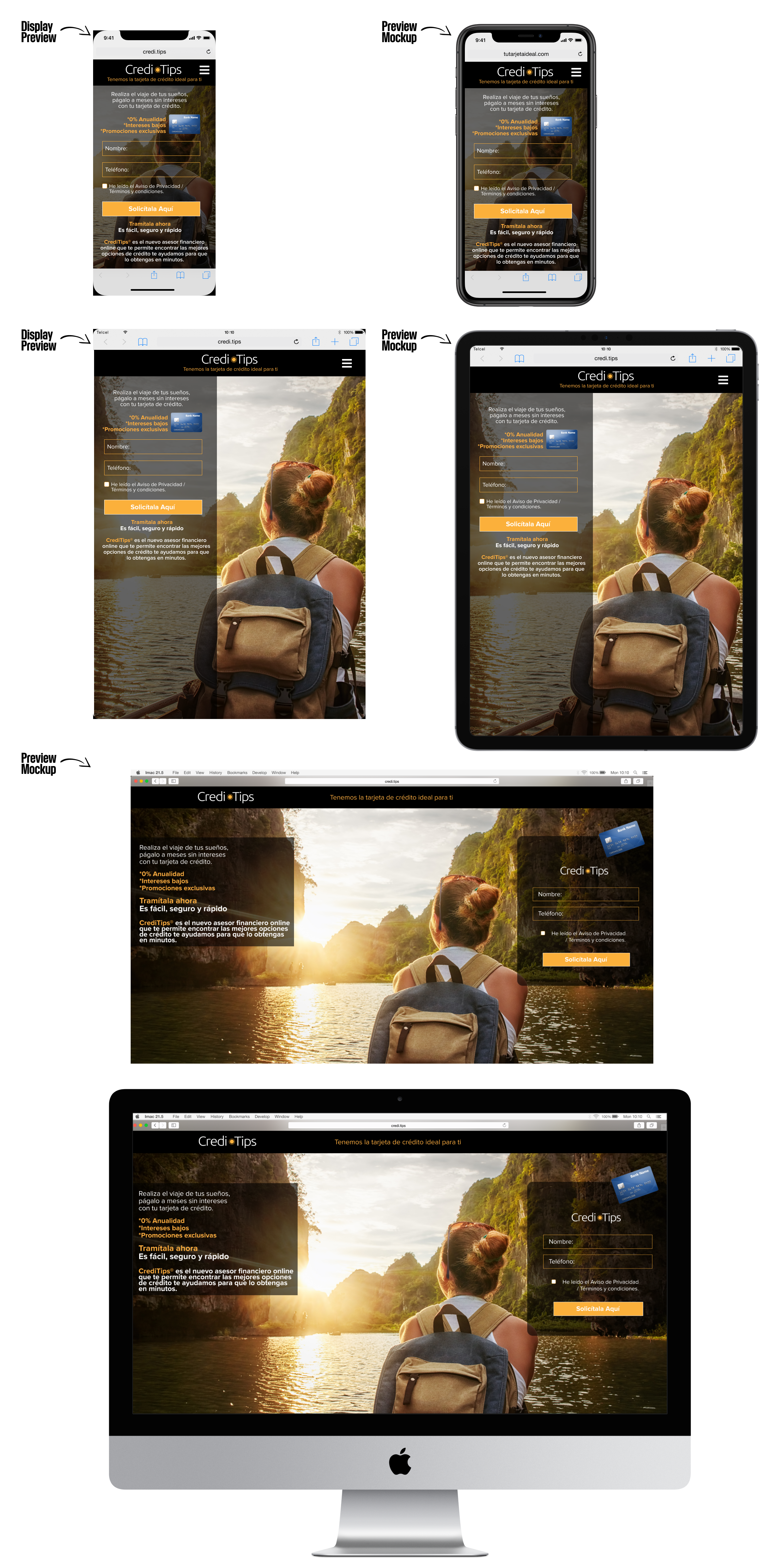
These examples images, I show the landing page proposal and view in display of devices and mockup preview and the same time designing the brand TTI (tutarjetaideal.com) with little different aspect, I create a button for calling and other to message changing all escenario, the button message resulting the best way for brand TTI and resolving a little problem to the contact customer
which is immediately.

Creative Direction

In the process of building Credi.Tips & TTI I started working with brand or financial institution, the first is Santander and creating a different Banners promotional in this moment I preferred creating a shorts videos for promotional different product  and follow different guidelines establishment for the brand.

Some time later added CityBanamex in this case the bank did not allow use the guidelines, I create different concepts for short videos promotional.

And the last institution financial added is AMEX, in this case is totally I freedom in create concepts graphics and follow the guidelines.

These examples is a different short video ads for acquisition leads in facebook and show you the concept graphic for this.