Super
Salud180

Web Design & UX-UI Design / Architectural Information

Profesional Experience 2014▲

banner_1_SS180

Introduce the health products
in the digital market

Service

Invent. is a Digital Media Company Exclusive Content and Digital Marketing

In this job I have the role of Web Designer/ Architectural Information, creating and updating a eCommerce with the name of Super Salud180.com. a eCommerce of product of health, resolving problems of graphics, UX/UI and Advertising all around to the eCommerce, I launched different campaigns of digital marketing in Google, Facebook and all web platforms of the same corporate.

My responsibilities
in the project.

I create a different themes of mailing for contact of us own data base of clients, creating landing page for acquisition for new clients and different campaign of feedback in products, my first objective change the home page every month improve the UI, after this I started of creating specials pages for products exclusive sell in web site.

I make a benchmark for up-growing my capacity of resolving problems of UX, and the same time started learning UX/UI Design and different methods of design for creating other products, for example: packaged of different programs of health and creating graphic for print for example: labels, guides, packaged and other stuffs.

I also did photographic production for products to have my own stock and design more graphics.

The Platform

The Home

This screenshot is of the hard work in the UX/UI design, architectural information and more is come true.

The Product detail 

The product page with own photo shoot and create a menu float in the left target in different section of the page with information and details of product is more important in health products and this impulse a the customer purchase the product, I like incorporate a section of more products in relationship with the principal product.

The Landing Pages

Is a very important create landing page is a complement in each campaign launching all data collected in own data base, I like incorporate banners with discounts or promotional for potencial customers, the principal information is more practical for the user and the landing page is responsive for different devices.

The Mailing

Every design a mail themes with different discounts or promotional products for sending everyday, all create and sending in Mailchimp, this is a little examples of this hard work release everyday.

The Banners

This examples are a promotional plan of health banners is a unique design with elements successfully CTA, image clean and little animations for responsive devices every with identity brand.

The Banners Promotional

This examples are a promotional product of the day, every design a promotional banner is a unique design with elements successfully CTA, image clean and responsive devices every with identity brand.

The Banners External Sites

This examples is are banner design for external site, a promotional plan of health banner is a unique design with elements successfully CTA, image clean and little animations for responsive devices.

The Banners RR.SS.

This examples is are banners designs for Social Media in Facebook or Twitter all around of health topic with unique design with elements successfully, promotion in product, campaign temporals or tips of health.

Case of study

eCommerce Súper.Salud180

Resolving problems UX

Code of promotions

The example is one of the multiples problems on a eCommerce this first is application of code for promotions, in Super Salud180 everyday launching different type of promotions of products and generate unique codes for this for resolve the problem generate a three different ways, the first with a gif animate showing application the promotion in the check out in specific in the mouse pointer for appears in the section ‘introduce a code’, the second way is a create a banner on-click with code promotional and automate copy/paste in the section ‘introduce a code’ is more simple and the last in the product page with promotional or discount, in the button ‘Lo quiero’ and clicking automatic insert a code promotional.

This three different solutions obtain a different results and the best result is have more sell products and more easy way for the customer and increment in 20% the sell products with discount.

FAQ

The example is one of multiples problems in a eCommerce this is for FAQ (Frequently Answer Questions) a part of the UX experience, in this moment is when you have different doubts in the navigate across the platform, purchased products, check-out, or delivering times, in the way of easy is create a page with a FAQ.

Resolving your problems and doubts, but add a select round button in each question or answer for obtain your feedback and determinate what do you need? and pain points of the customers. other implementation of FAQ I add section help in main page and pop/up with the answer and questions.

The result is improve you experience in purchase a products in a eCommerce.

Remember a customer happy is a customer without a doubts.

Previous
Next

Order

The example is one of multiple problems in an eCommerce in this case is order at the moment of finishing your purchased and send the confirmation with you order number page, but I implemented other aspects in UX for example: Name of Customer, Message with thanks you, video with Deyana Cano Head Manager of Salud180 with video message, second message telling a little message enjoying and growup for connecting with customer and empathize with community and potencial clients, your order number and print your order with option downloading in pdf document, section share in your RR.SS. or ‘Tell a friend’ and banner with promotional or pre enroll for services.

The results: well empathize with your community or potencial clients is a answer for have constant sales, increment deliveries and make your client feel that they are part of a community.

Testing A/B Mailing

The example is one of multiple problems in an eCommerce in this case testing A/B Mail taking 20% of 50% of my data base and sending same content only with ‘Different Subject’ and improving the result clicking and selling the promotion day or other products. 

In other testing taken all data base and sendding two different content with promotional product or discount in multiple products and improve the result in next mailings, this activity constantly testing in different time of the day and fast promotionals or temporally. 

This implementations is all around of experience of customer and standing behaviors in different situation or scenarios.

The Home

The example is one of multiple problems in an eCommerce in this case grand change the home.

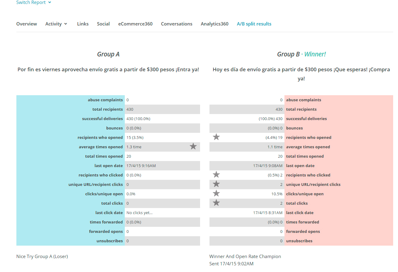
This case of study in the moment of determinate a intension of change all the content of the page I use Crazy Egg for understanding all customers and check the different problem on different section of my home page, next step i release a real interviews with 5 people 3 womans and 2 men with taste for healthy products 1 laptop and home connection of 5 mb downloading at that time it was the most used internet connection.

The survey starting with answers for example:
-What do you think of the online store?
-Was it difficult to locate the menu?
-Was it difficult to understand the product page?
-Was it difficult to apply the promo code?
-What would you like to see on the home page to streamline your product search?
and Between other question more specific.

the result is improve my home page for reduce the bouncing rate and impulse the customer a search the products or navigate in category of products and purchase more easy across the platform. 

The examples is the result of applicate the change and improve my home page.

Data analyzing:

-Grow up the purchase of products in 25%.
-Reduce the bounce rate in 20%.
-The search of product base on category section and improve the flow user.
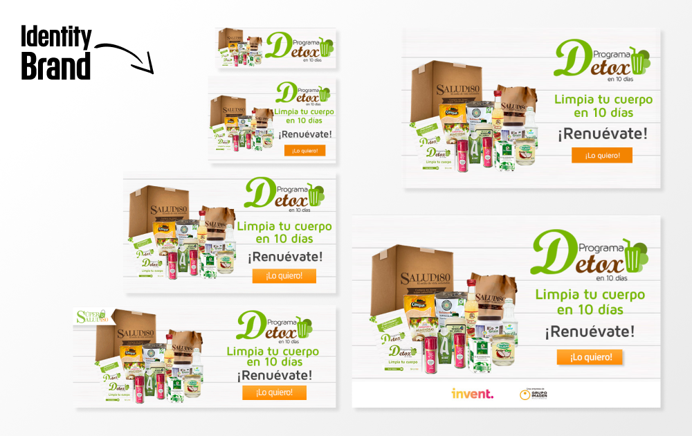
– Improve my section banners with slides between 3 to 6 and image and 2 or 3 banner static for new brands or especial offers.

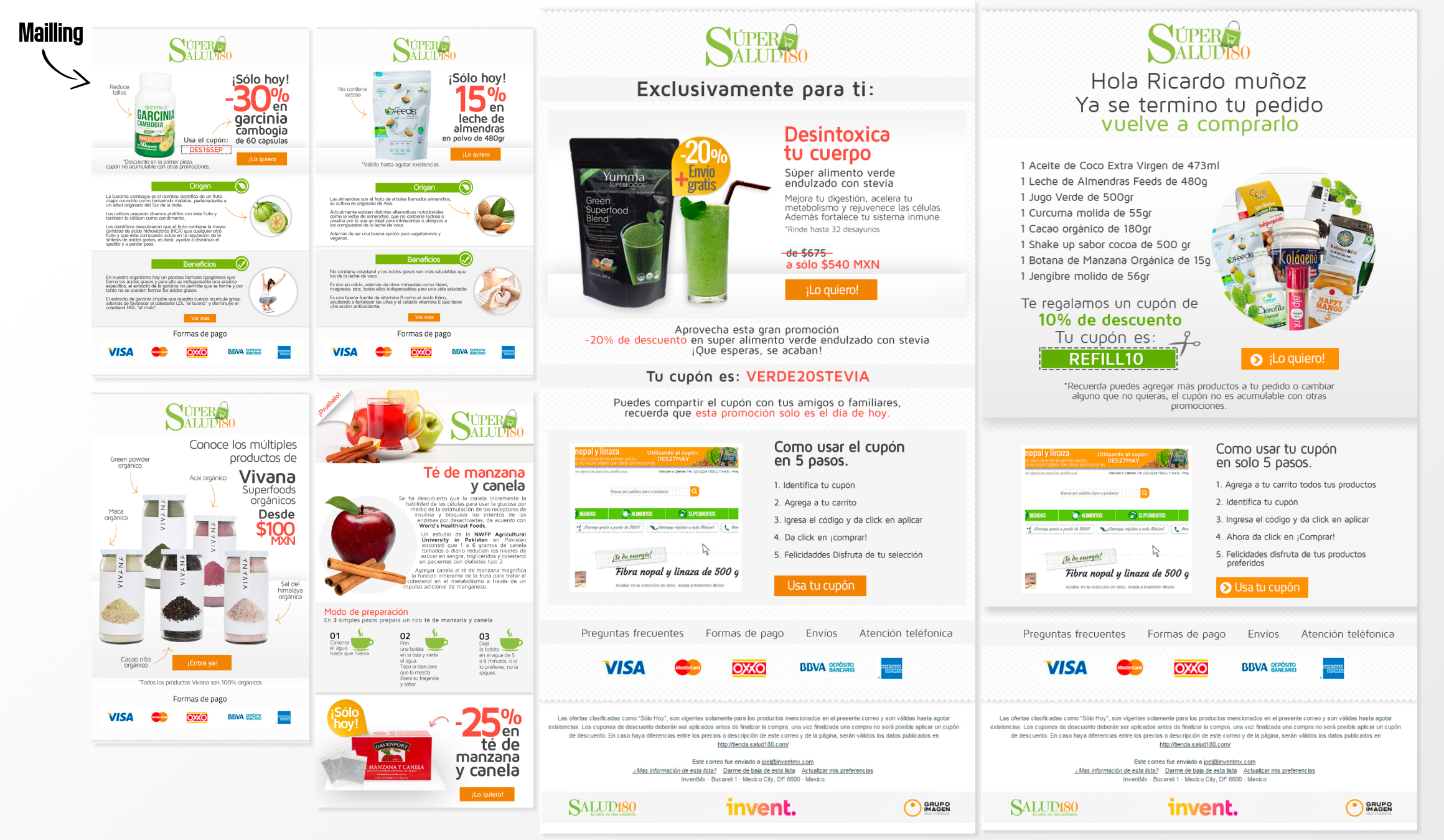
and multiple changes on product page mailing welcome and other behavior of clients.
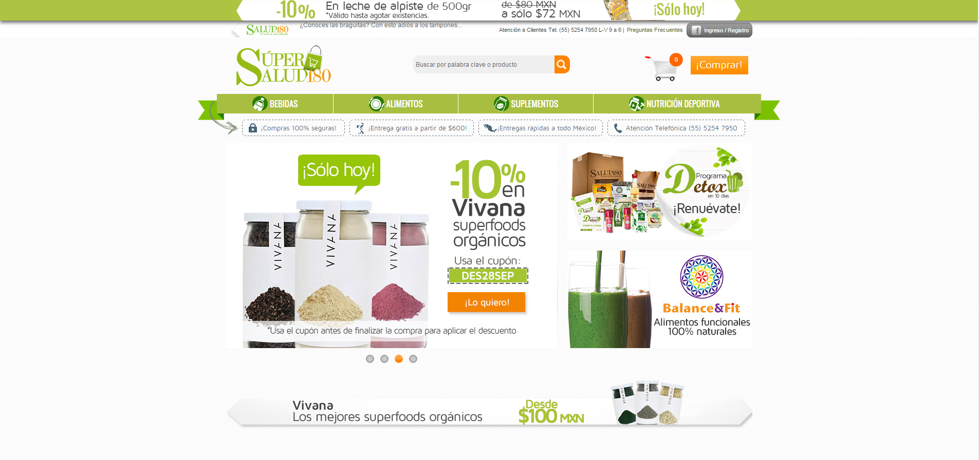
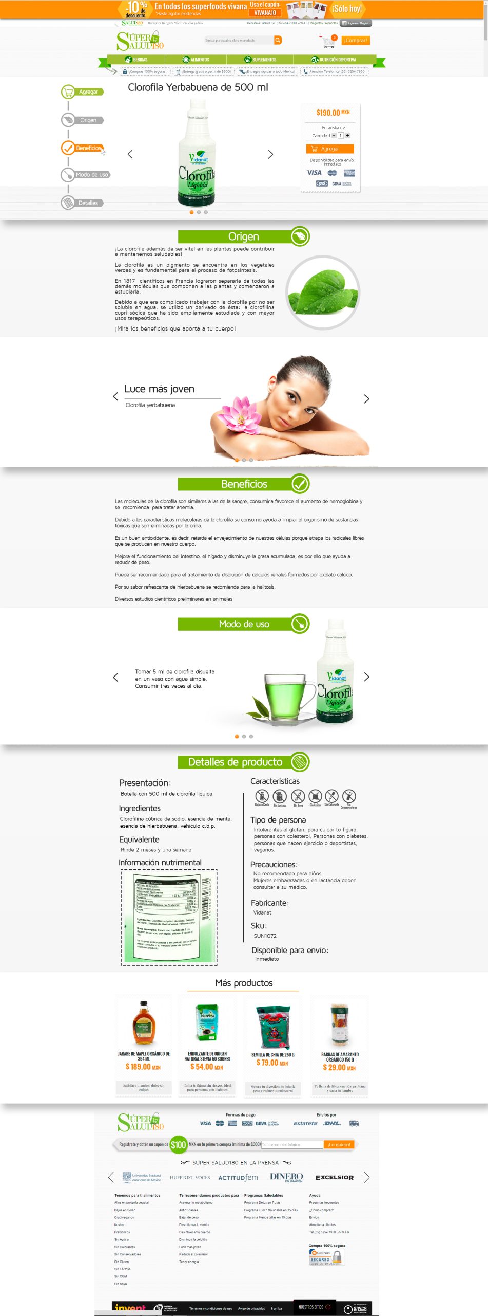
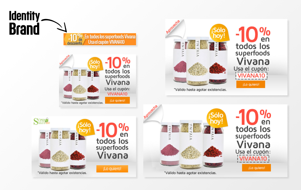
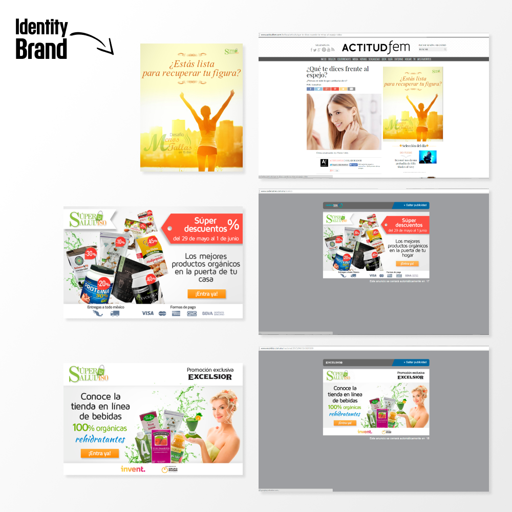
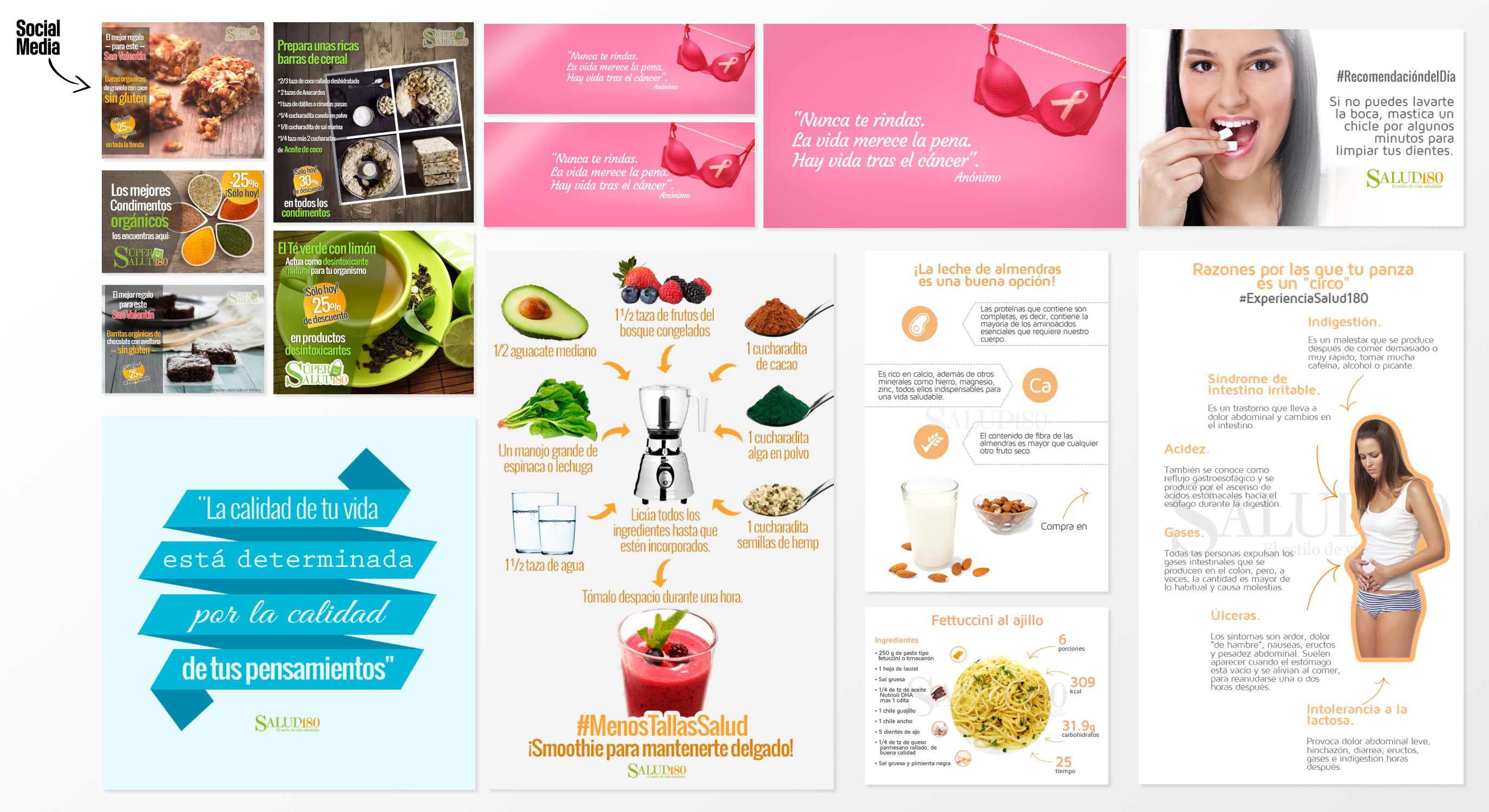
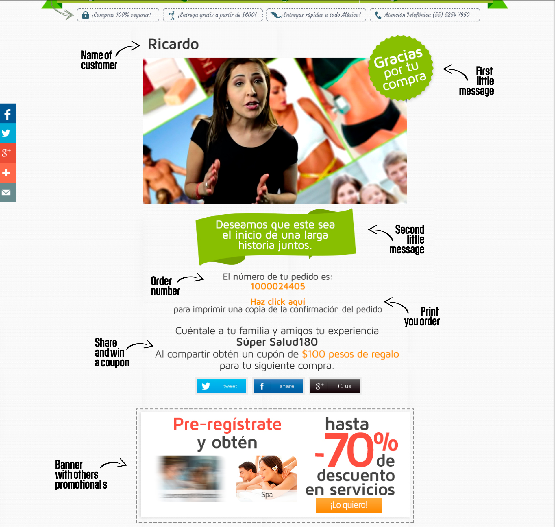
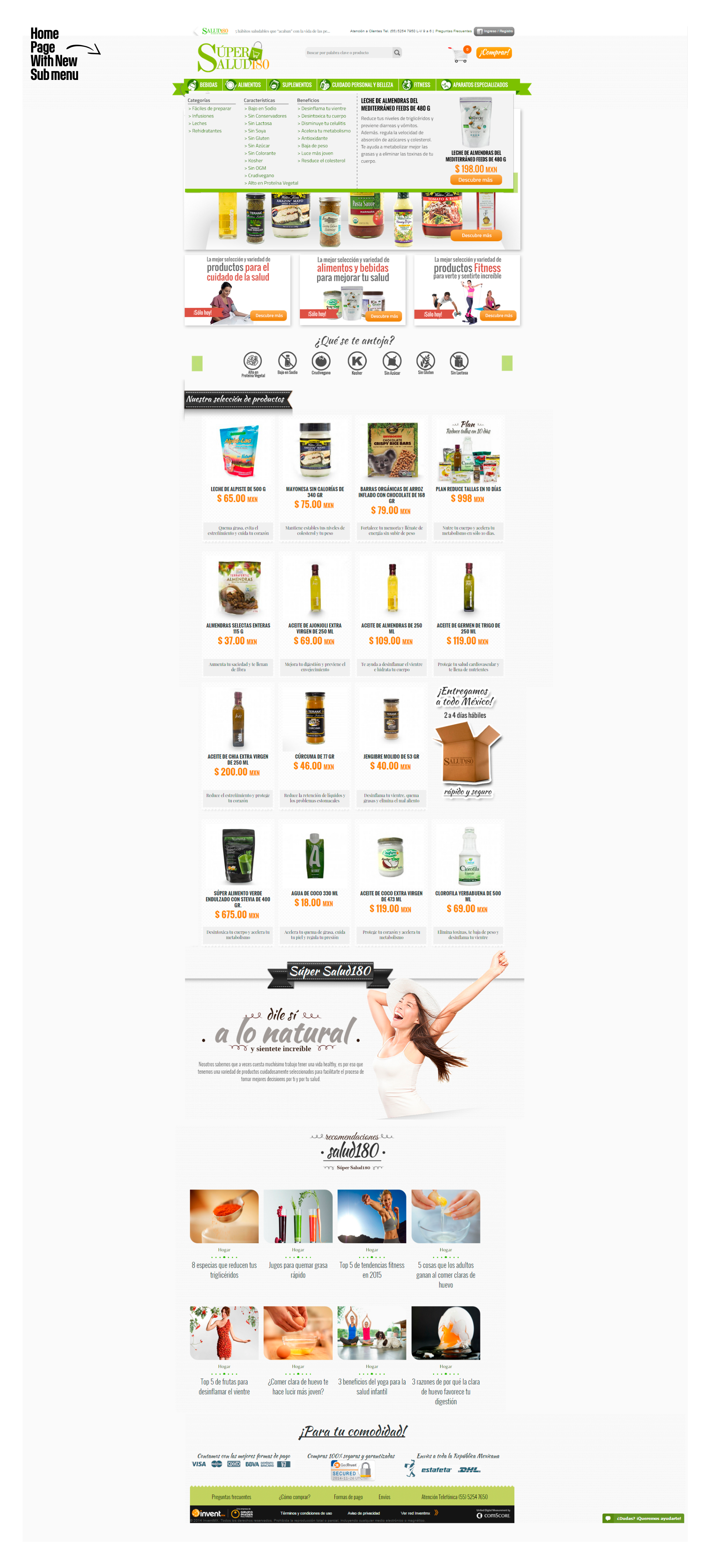
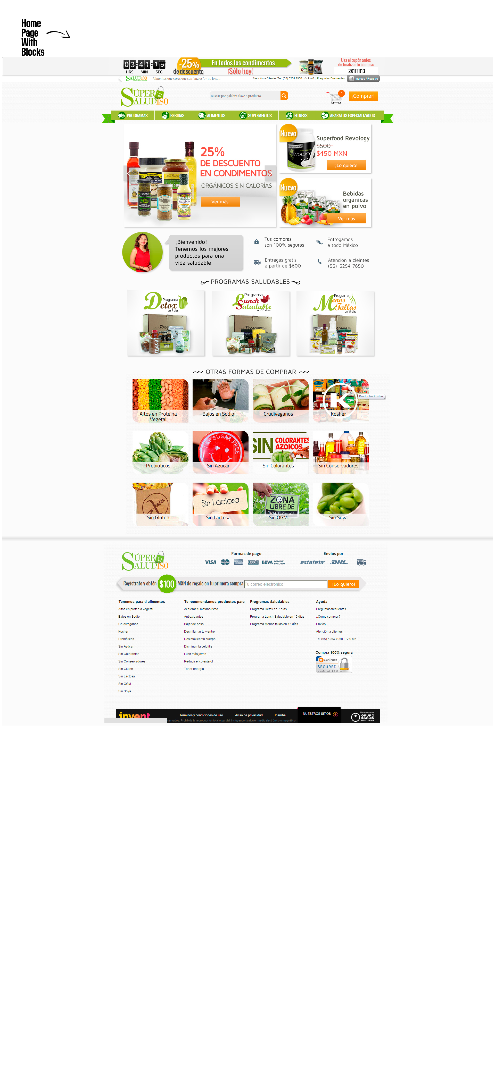
Gallery:

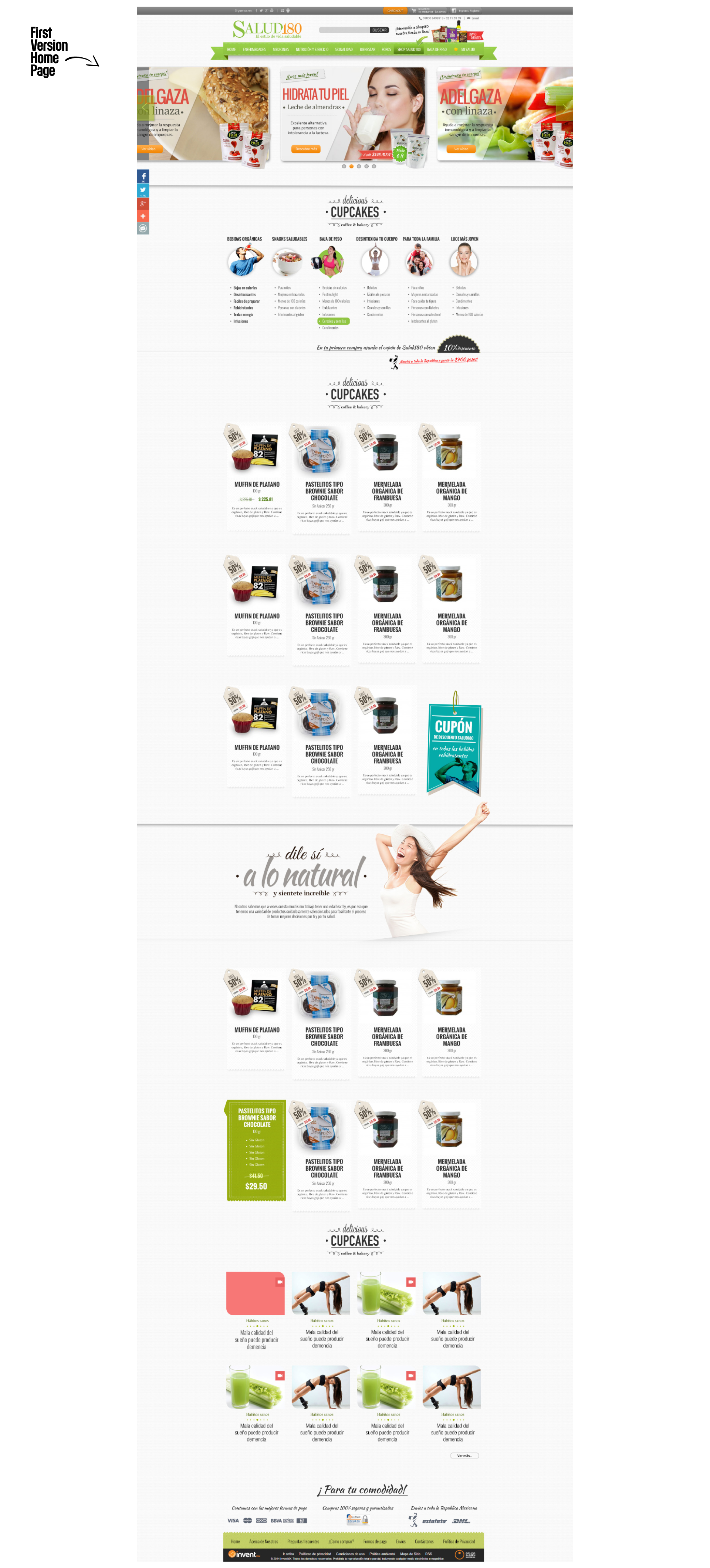
1. Image of home page before being named Super Salud180.

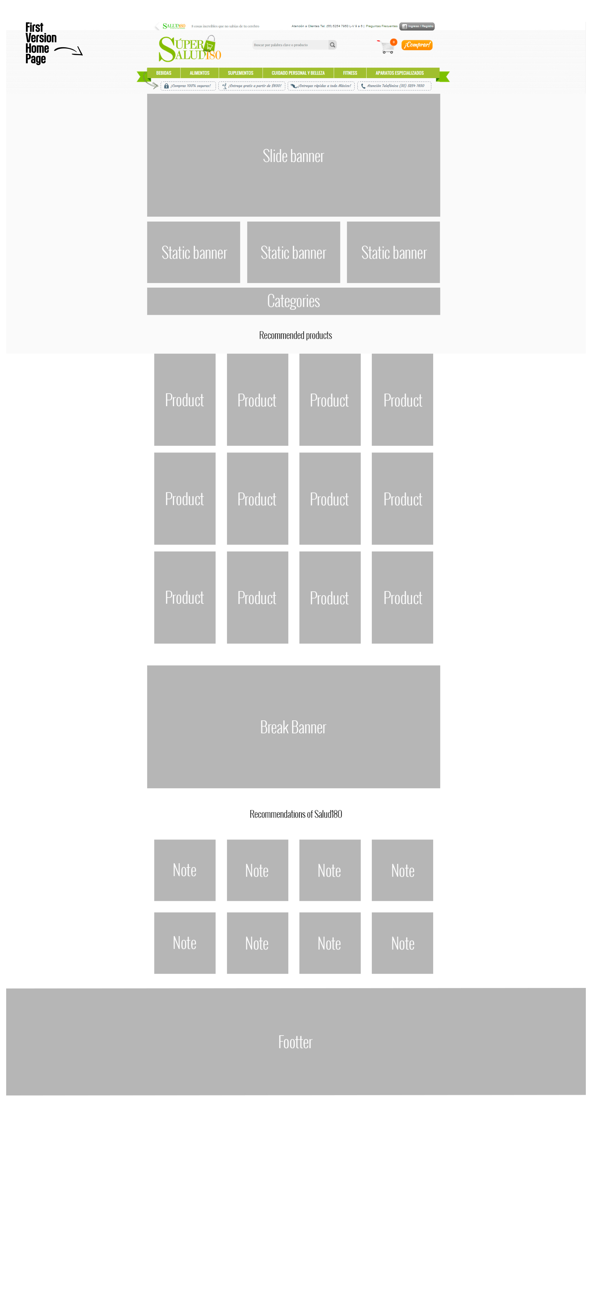
2. Image with new head (Logo, Search Bar, Log-In, Menu and other stuff ) and wireframe proposal.

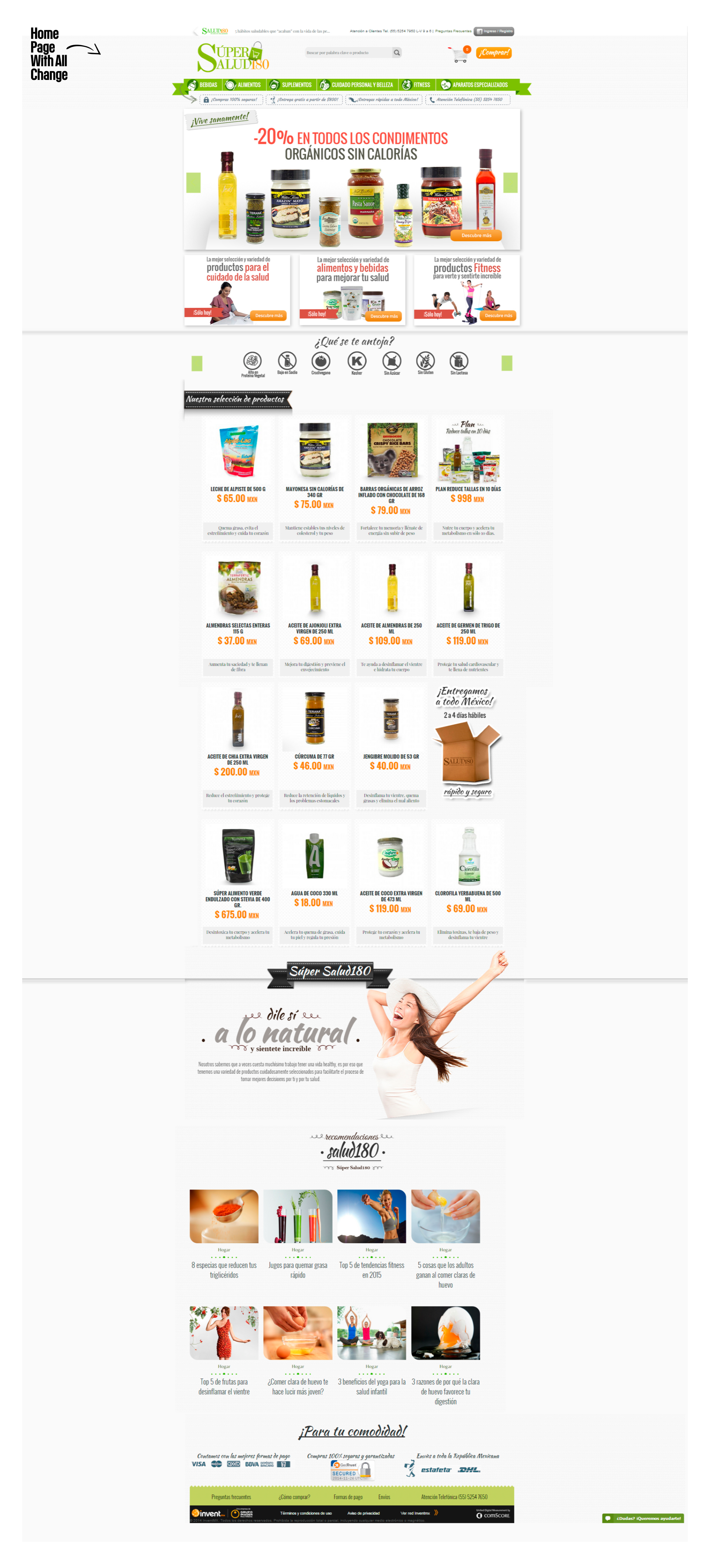
3. Image with all changes new banners and implementations (This change applicate in one moth and seeing soon the results in every change applicate)

4. Image with home page and new sub menu 

5. Renew the home every month and applicate all the new proposals in last 6 month and this is the results.

6. The last change in home page and more clean design and effectivity.


Conclusions

In the eCommerce is so very difficult understanding all customers and taken the best decisions, but the improve your design, is necessary applicate different technics of UX/UI and the best practice in eCommerce, thats results is generate more easy way for the customers and your purchase experience.

In the time of improve more parts of the eCommerce, I having to research, make brainstorming, Benchmark, flow maps, user maps, architectural information and take more decisions to improve the platform all this with data analysis for reduction bounce rate, improve the purchase products, launching campaings of advertising in other platform or media and RR.SS.

▲ Thank you for view part of my work▲